123.3k stars · MIT · shadcn@4.21.0 (2026-09-04) · Track this in Rising ↗
Not a library you install — a folder of accessible React components you own, copied into your repo.
Radar check
What we found when we opened it. Every bar is one fact, with its date.
Last code pushed 27 Oct 2026, the same day before this check.
Latest release shadcn@4.22.1 on 18 Oct 2026.
Public since January 2023, a little over 3 years.
126,654 stars and 12,543 forks.
274 commits and 131 new issues in the last 90 days.
648 contributors. 257 pull requests merged in 90 days.
A security policy says how to report a problem. No published security advisories.
How the bars are scored
- Alive. Days since the last code push: a week or less 100, a month 90, three months 70, six months 50, a year 30, eighteen months 15, older 0.
- Releases. Age of the latest GitHub release, on a similar scale; no bar when the project publishes no releases.
- Maturity. Age of the project: eight years 100, five 90, three 70, two 55, one 40, six months 25, younger 10.
- Adoption. Stars on a log scale: 100,000 stars is 100, 10,000 is 80, 1,000 is 60, 100 is 40.
- Activity. Commits in the last 90 days: 300 or more 100, 100 85, 30 65, 10 45, any 25.
- Community. People who have contributed: 100 or more 100, 30 80, 10 60, 5 40, 2 25, one 10.
- Security. A published security policy 80, none 40; published advisories are listed, not scored.
Checked by Repo Radar on 27 Oct 2026 from the repository on GitHub. Covered in Edition 12.
▶Repo detailsthe review · specs · pros & cons · install
What it does
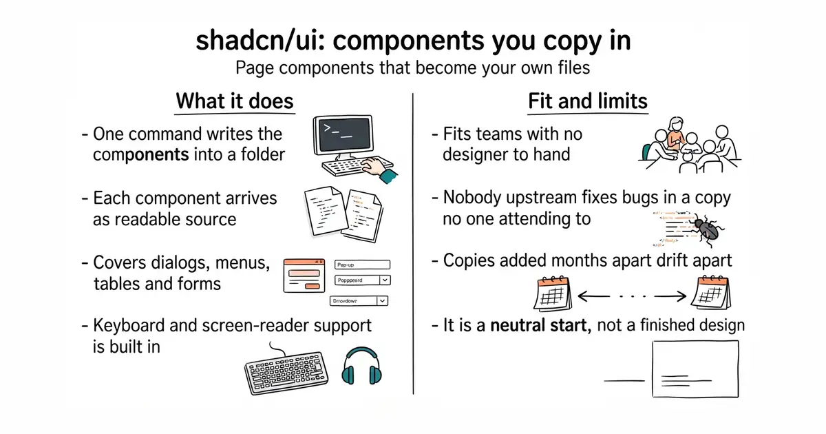
A command-line tool writes component files into a folder you choose inside the project. Each component is plain TypeScript and JSX, which is the source format React developers already read, styled with Tailwind CSS, a system of small utility class names applied in the markup. The behaviour underneath comes from Radix primitives, which handle keyboard control, focus and screen-reader labelling. The catalogue covers dialogs, dropdown menus, data tables, forms, tooltips, date pickers, charts and dozens more. The command-line tool is version 4.22.0 on npm, and the newest tag in the repository is @shadcn/helpers@0.3.0, dated 16 October 2026. It is deliberately not a package: there is nothing in node_modules to upgrade, and no component version to pin. It also does not design anything. What arrives is a plain, neutral starting point that still has to be shaped into a particular product's look.
Why it matters
Who it suits. Teams with a React application whose screens were each styled on whatever afternoon they were built, and who have no designer to hand. The copy-in model is what makes it suitable for developers rather than design teams: the components become files in the repository, so a coding assistant can read and edit them like any other source. Skip it if the project does not use Tailwind CSS, because adopting Tailwind is a much bigger decision than adding components.
Verdict. Worth a week of work, and the payoff is visible on the first screen. The honest cost is maintenance: a component copied in January and another copied in July will drift apart unless somebody deliberately re-runs the tool over both. Plan for one afternoon a year spent re-syncing. If you want the same look without React, hunvreus/basecoat does it in plain HTML. If you would rather have a package somebody else upgrades, mui/material-ui is the conventional answer.
- The component code sits in the repository, so there is no upgrade treadmill and nothing breaks on a dependency bump.
- Keyboard control and screen-reader labelling arrive built in through Radix, rather than being added later.
- A very large public example base, which makes coding assistants unusually good at it.
- It assumes Tailwind CSS. Outside that, this is a much larger decision than it looks.
- Owning the code means owning the bugs, because nobody upstream patches a copy.
- Components added months apart fall out of step unless the tool is deliberately re-run.
npx shadcn@latest init
npx shadcn@latest add button dialog table tooltip