1.7k stars · MIT · no releases published; 93 commits
A gorgeous, accessible colour system — scales with properly matched light and dark pairs.
▶Repo detailsthe review · specs · pros & cons · install
What it is
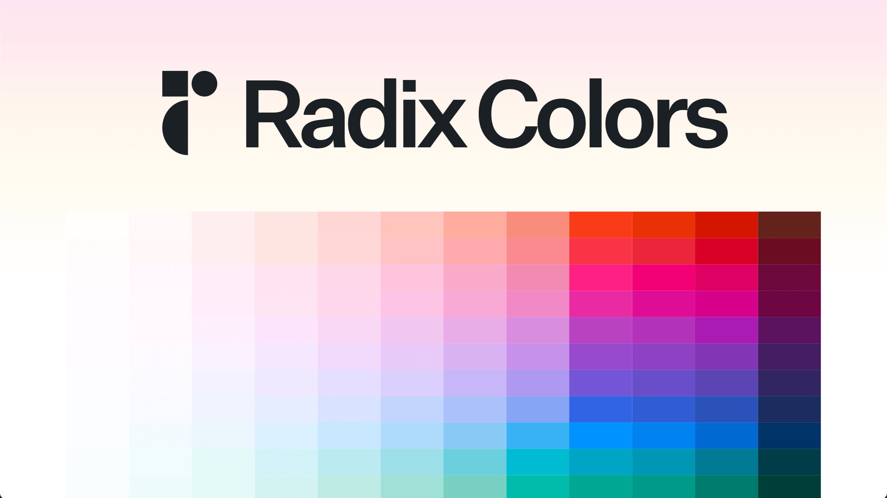
Radix Colors is a set of colour scales delivered as CSS files and JavaScript objects. Every scale has twelve steps, plus see-through and wide-gamut versions, and the steps are built so text and background pairs meet accessibility contrast rules.What it is good for. Anyone building an interface without a designer. The real gift is not the colours, it is the numbering. Step 3 is always a subtle background, step 9 is always the solid one, step 11 is always readable text. Swap red for blue and everything still works, because the steps mean the same thing in every scale. It has no dependencies and it is not tied to React, so it works with plain CSS or anything else. There is a direct use here: Grasppy's map needs many colours that stay distinct and readable when the page switches between light and dark, and that is exactly the problem this set was built for.
- Free, MIT, and it is just data. No runtime code and nothing to keep updated.
- Light, dark, see-through and wide-gamut versions of every scale, all matched to each other.
- The contrast work is already done, so text on the recommended background is readable.
- No GitHub releases at all. To find out what changed you have to read the npm page or the changelog file, not the releases tab.
- It is colour only. Spacing, type sizes and shadows are not here — open-props covers those, and it is in the backlog.
- The project now sits under WorkOS, a company. That is not a problem today, but it is a company's project and not an independent one.
npm install @radix-ui/colors