5.5k stars · MIT · v1.6.0 (2023-09-29) · Track this in Rising ↗
CSS custom properties for spacing, colour, shadows and easing — design tokens without a framework.
Radar check
What we found when we opened it. Every bar is one fact, with its date.
Last code pushed 11 Oct 2026, 16 days before this check.
Latest release v1.6.0 on 29 Sep 2023.
Public since September 2021, about 5 years.
5,553 stars and 220 forks.
2 commits and 2 new issues in the last 90 days.
67 contributors. 2 pull requests merged in 90 days.
No security policy file says how to report a problem. No published security advisories.
How the bars are scored
- Alive. Days since the last code push: a week or less 100, a month 90, three months 70, six months 50, a year 30, eighteen months 15, older 0.
- Releases. Age of the latest GitHub release, on a similar scale; no bar when the project publishes no releases.
- Maturity. Age of the project: eight years 100, five 90, three 70, two 55, one 40, six months 25, younger 10.
- Adoption. Stars on a log scale: 100,000 stars is 100, 10,000 is 80, 1,000 is 60, 100 is 40.
- Activity. Commits in the last 90 days: 300 or more 100, 100 85, 30 65, 10 45, any 25.
- Community. People who have contributed: 100 or more 100, 30 80, 10 60, 5 40, 2 25, one 10.
- Security. A published security policy 80, none 40; published advisories are listed, not scored.
Checked by Repo Radar on 25 Oct 2026 from the repository on GitHub. Covered in Edition 18.
▶Repo detailsthe review · specs · pros & cons · install
What it does
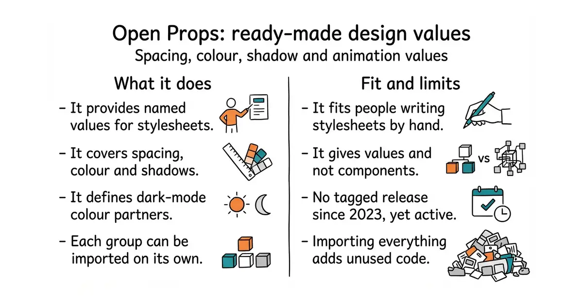
Open Props is a collection of CSS custom properties, which are named values that can be reused anywhere in a stylesheet. It covers sizes, spacing, colours, shadows, borders, gradients, easing curves and whole animations, with dark-mode partners already defined for the colours. It is plain CSS, so there is no build step and no framework. The parts can be imported separately, so a page can take the spacing scale and nothing else. It also ships as individual files per group for anyone who wants to pick by hand. The newest tagged release is v1.6.0 from 29 September 2023, while the package registry is on 1.7.23 and the newest code change landed on 11 August 2026. It gives values and not components, so there is no button, card or menu in it.
Why it matters
Who it suits. It suits people writing CSS by hand who want a site to look consistent without designing a system first, and it is the quickest route to a considered-looking page in plain CSS. It suits a small project where adding a whole framework would be too much. Skip it if the project already uses Tailwind or another system that owns these decisions, and skip it if what is needed is ready-made components rather than values.
Verdict. Worth twenty minutes, and the shadows and easing curves alone are worth it, because those are the values people usually get wrong. The thing to know before reading the repository is the release gap: three years with no tag looks like a dead project and is not one, and the code date is the number that settles it. Importing the whole set adds CSS that a page may never use, so import only the needed parts. Edition 16 covered radix-ui/colors, which does the colour half of this problem very well, and the two combine without fuss.
Summary (Key Points)from the README
Key features
- Broad token categories: Covers colors, gradients, shadows, aspect ratios, typography, easings, animations, sizes, borders, z-indexes and media queries as CSS variables.
- Normalize demo: Includes a Normalize demo that shows the props in light and dark modes.
- Design token exports: Provides Design Tokens, Figma Design Tokens and Style Dictionary Tokens for use in design and build tooling.
- Bookmarklet: Offers a bookmarklet for trying the props on a page without installing anything.
- Scope variants: `gen:nowhere` builds a version without `:where()`, and `gen:shadowdom` scopes the props to `:host` for Shadow DOM.
- Prefixed variables: `gen:prefixed` adds an `op` prefix to every prop, such as `--op-font-size-1`.
- Minified bundles: `npm run bundle` creates all the minified bundles of props.
- NPM JavaScript modules: `npm run lib:js` builds the JS modules for NPM.
Ways to install
| Platform or method | What it needs | Effort |
|---|---|---|
| CDN | A stylesheet link to the hosted props; the README's CDN URL is not shown in this text | Low |
| Bookmarklet | A browser with the bookmarklet added | Low |
| CLI | Node and npm, plus the repository's `src/` files to generate from | Moderate |
Important
- Generated files: The CLI commands create PostCSS files in `src/` and bundles, so you need to run them before the output exists.
- Variant choice: Pick the `:where()`, Shadow DOM or prefixed build deliberately, because each changes how selectors or variable names look.
- Testing: The README's Testing section has no details, so the test process is unclear from this file alone.
- Support: Help is offered through Discord, and the README gives no other support channel.
Written by an AI model from the project’s README; not part of the review, and it can be wrong.
- Plain CSS. No build step, no framework, and only the needed parts have to be imported.
- It covers the values people usually get wrong, especially shadows and easing.
- Dark-mode partners are already defined for the colours.
- No tagged release since 2023, which reads as abandoned until the code date is checked.
- It gives values, not components. Nothing in it looks like a button until one is built.
- Importing the whole set adds CSS that may go unused.
cd ~/your-site
npm install open-props